UX/UI case
This digital education platform, which currently has over 100,000 users, was created to help entrepreneurs expand their knowledge in management, finance, marketing and sales.
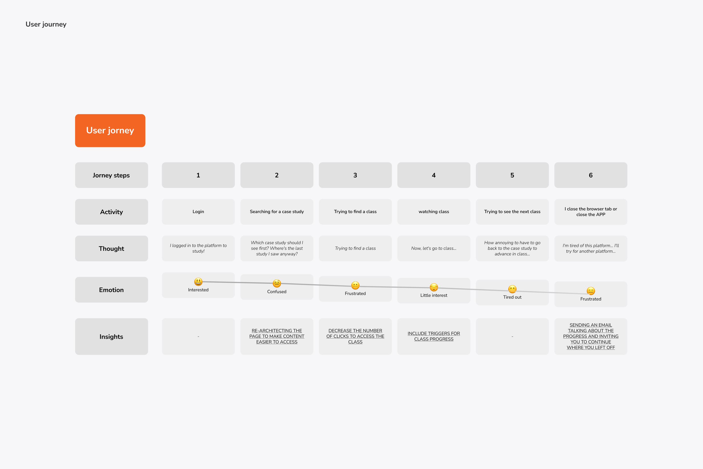
The tech squad had a Q3 2022 target to improve meaningful engagement. We started our understanding process through a preliminary immersion, where we looked for indicators that were linked to product engagement. Our objective was to understand its current state, raising doubts and hypotheses of problems, which would later guide our steps.
Designer lead - Eduardo Bonifácio
UX/UI designer - Rafael Fraga
Read the full article here
Discovery
We then made progress in collecting data linked to our context and which were already easily accessible, with the aim of raising new hypotheses and better defining the problem we were going to attack. We carried out our searches by surveying comments on the app stores, NPS (Net Promoter Score) and quantitative data available on Hotjar and Google Analytics.


Delivery
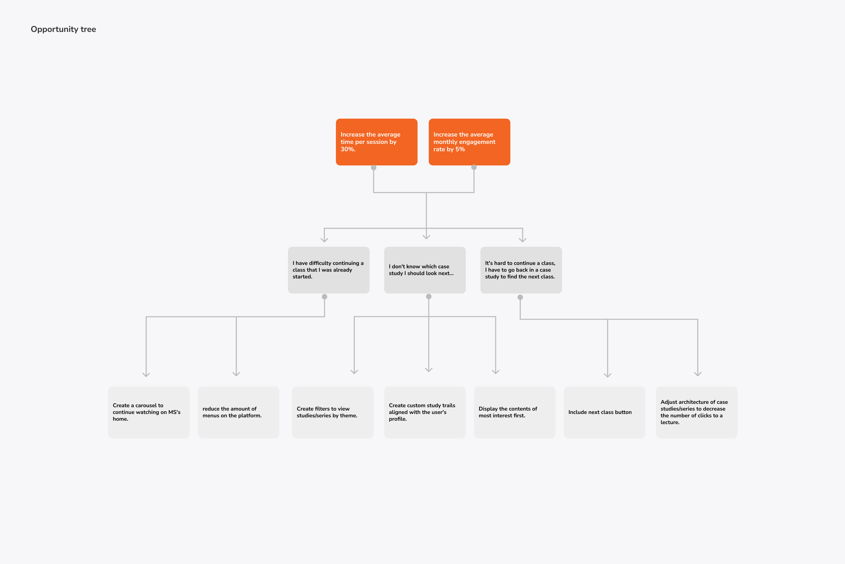
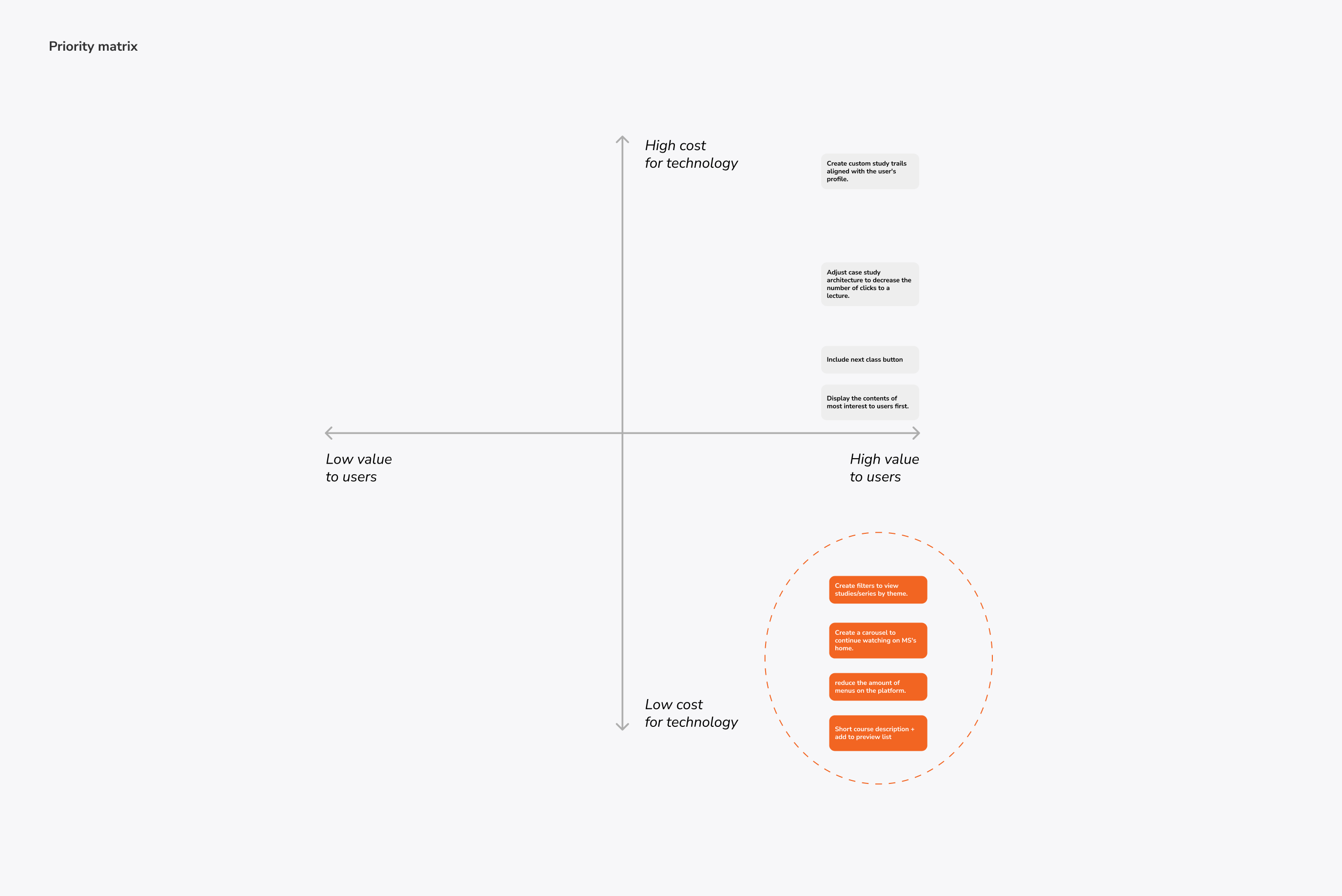
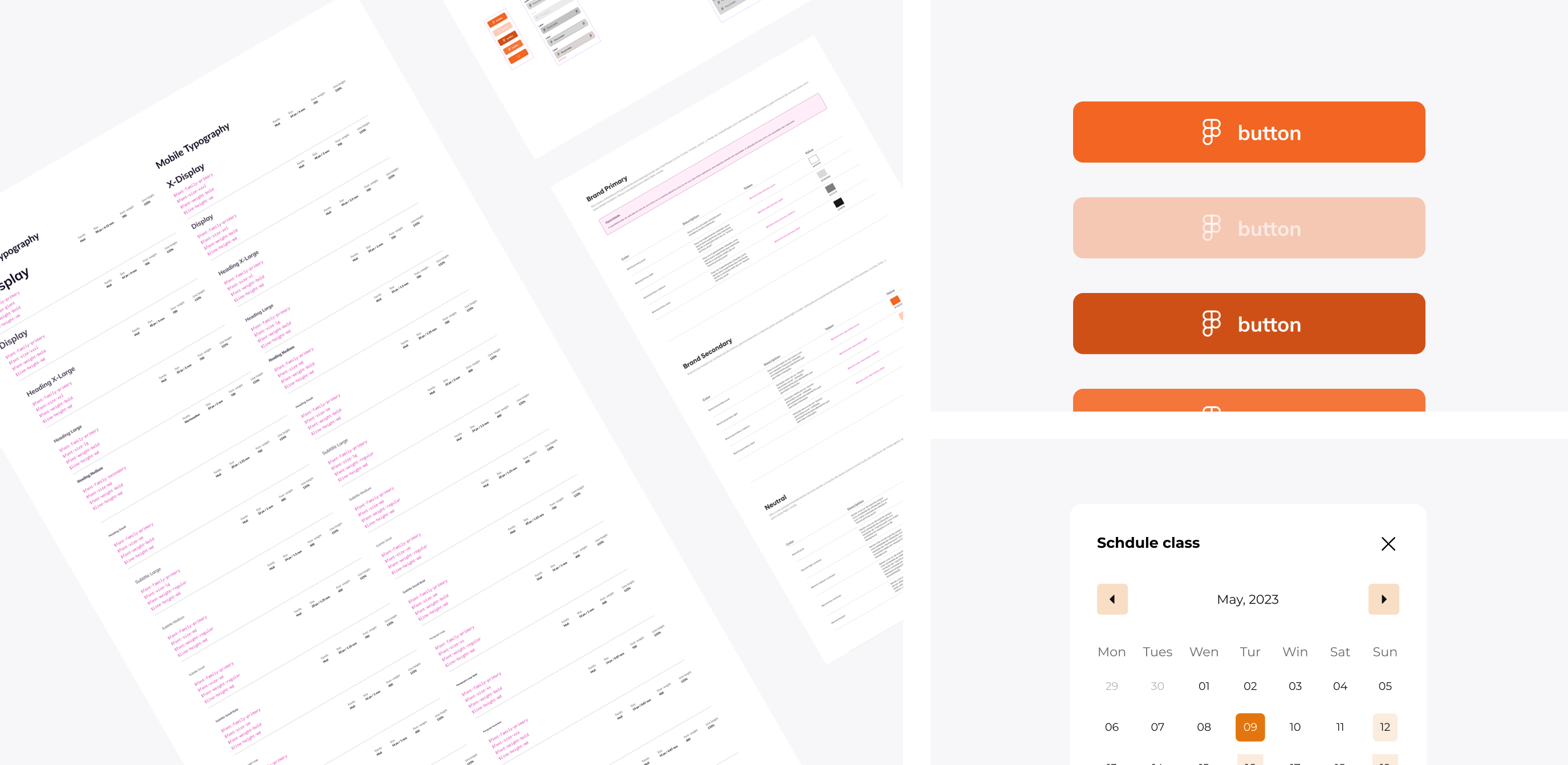
Our idea was to reduce the number of clicks to access the case studies, highlighting the filter tool, and making the other contents more visible to users, in addition to making it clearer which was the list of classes attended by unifying the menu side view and including a Carousel of Keep Watching. After defining changes and aligning with the team, we started building the interface using all the tokens and components of our Design System.

Usability tests results
In order to mitigate risks, we carried out a usability test with 5 people, measuring interactions such as clicks, length of stay, feelings and complications during the journeys. Our roadmap encompassed 4 main tasks:
Time to perform tasks
12-15s
Average number of clicks
2-3
Completion rate
100%
Difficulty perceived
Very easy